
A reader emailed me to ask about how one should choose between keycap front and side engraving. Well, I didn't think this needed to be detailed, but since someone wanted me to answer it, let's get started. Whether you’re a typing ninja or a desk aesthetic enthusiast, this guide will crack the code on which style suits you best. Buckle up—it’s time to geek out!
Round 1: Looks Matter! Who’s the Beauty Queen?
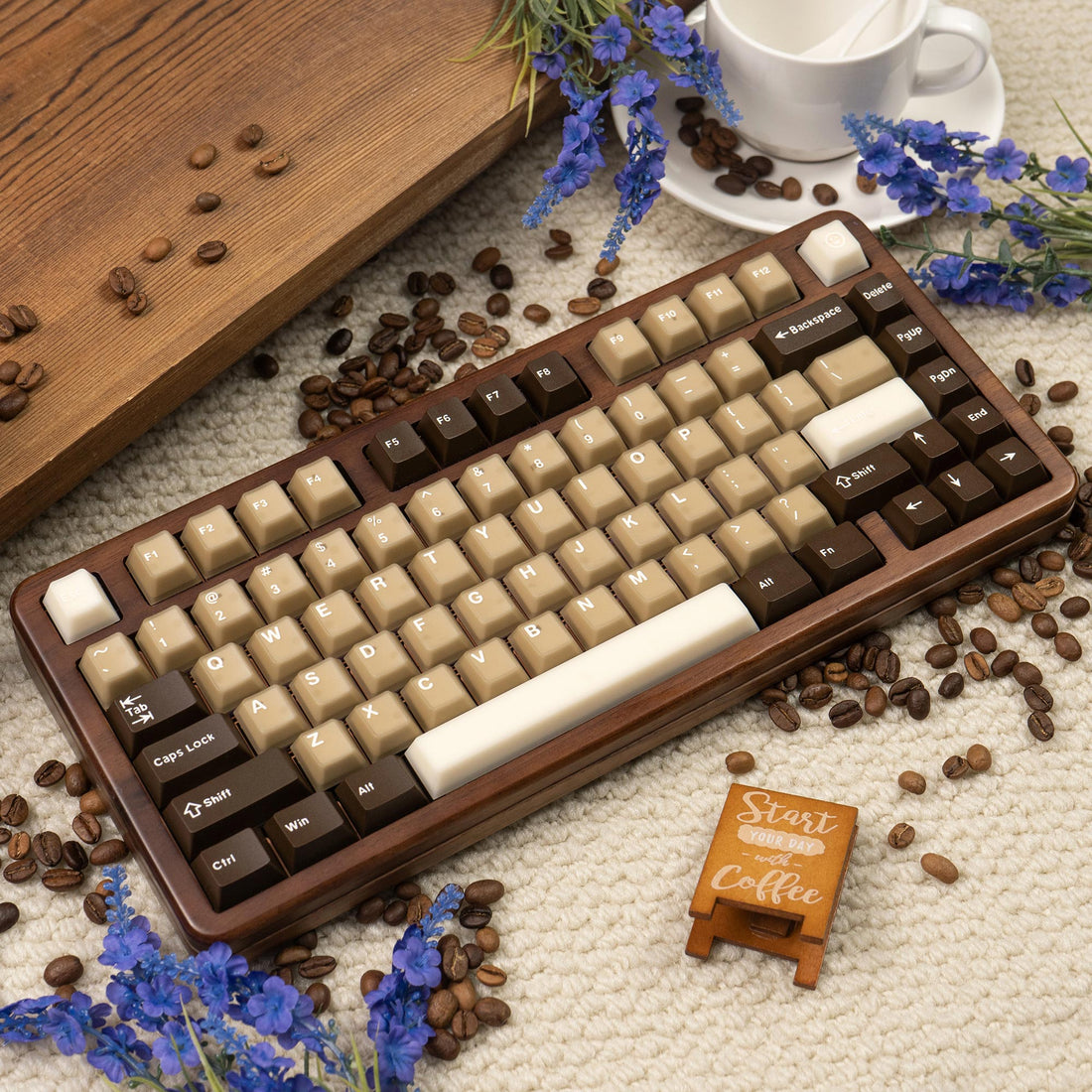
Top Print is like the “classic jeans” of keycaps—reliable and everywhere. The legends are stamped right on the top surface, making them easy to read from a bird’s-eye view. Perfect for beginners or anyone who needs to glance down mid-typing (no shame, we’ve all been there!). But let’s be real: from a front view, those crowded letters can look like a chaotic party .
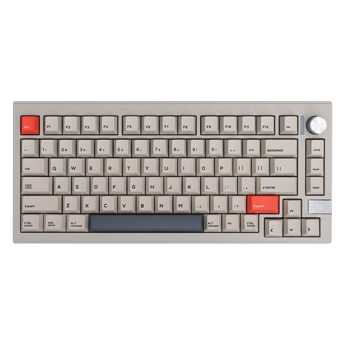
Side Print, on the other hand, is the minimalist influencer of the keyboard world. Legends are stealthily carved on the front edge of the keycaps, creating a sleek, clutter-free look. Imagine a keyboard so clean it could double as a Zen garden—no distracting text, just pure color vibes . Pro tip: Side Print fans are either design snobs or secret agents who hate fingerprint smudges .
Winner—Side Print for aesthetics, Top Print for practicality.

Round 2: The Craftsmanship Battle—Why Does Side Print Cost More?
Top Print keycaps are the “fast food” of manufacturing: cheap and quick. Most use simple techniques like laser etching or ink printing, which work well but wear off over time (RIP, faded WASD keys) .
Side Print? Think “artisanal sushi.” The legends are trickier to print because they’re on the edge. Manufacturers often use laser engraving or specialized molds, which cost more time and money. Bonus: Side Print legends avoid finger friction, so they’re less likely to fade . But here’s the catch—if your keyboard has RGB lighting, Side Print might not glow as brightly as Top Print. Talk about a mood killer!
Winner— Side Print for durability, Top Print for budget-friendliness.

Round 3: User Experience—Comfort or Flex?
Top Print is like your grandma’s cooking: comforting and familiar. The legends are right under your fingertips, ideal for hunt-and-peck typists or gamers who need quick visual cues . But if you’re a fast typer, those legends might rub off faster than your enthusiasm for New Year’s resolutions .
Side Print demands a bit of blind-trust swagger. You’ll need to tilt your head slightly to read the legends (or master the art of side-eye typing). Once you adapt, though, it’s smooth sailing—plus, your desk will look Instagram-ready 24/7 . Warning: If you’re a RGB junkie, check if your keyboard’s backlight aligns with the side legends. Otherwise, you’ll be squinting in the dark like a confused raccoon .
Winner—Top Print for ease, Side Print for bragging rights.

Final Verdict: Which One’s Your Soulmate?
If you’re a typing newbie or need clear visibility,or on a budget but still want durability,or your keyboard has flashy RGB lighting. Choose Top Print.
If you’d sell a kidney for a clean, minimalist desk,or you’re tired of faded legends and want long-lasting beauty,or ready to flex your “I’m-too-cool-for-top-print” attitude. Choose Side Print.
Pro Tips for Keycap Care:
For Top Print: Avoid acidic snacks (sweaty fingers accelerate wear!).
For Side Print: Use a keycap puller gently—no scratching allowed!
For both: PBT material > ABS. Trust us, your future self will thank you .
So, which camp are you in? Let us know in the comments—and may your keystrokes be ever satisfying!
2 comments
🔖 Ticket; Process 1.895163 bitcoin. Get =>> https://graph.org/Message--04804-03-25?hs=da6b1cee8eb43eaf4200a8ff741a5ccb& 🔖
bxvg6b
📄 + 1.544092 BTC.GET - https://graph.org/Message--05654-03-25?hs=da6b1cee8eb43eaf4200a8ff741a5ccb& 📄
t8i8mm